view 视图容器
解释:视图容器。
百度APP中扫码体验:

属性说明:
| 属性名 |
类型 |
默认值 |
说明 |
| hover-class |
String |
none |
指定按下去的样式类。当 hover-class="none" 时,没有点击态效果 |
| hover-stop-propagation |
Boolean |
false |
指定是否阻止本节点的祖先节点出现点击态 |
| hover-start-time |
Number |
50 |
按住后多久出现点击态,单位毫秒 |
| hover-stay-time |
Number |
400 |
手指松开后点击态保留时间,单位毫秒 |
示例:
在开发者工具中预览效果
1
2
3
4
5
6
7
8
9
10
11
12
13
14
15
16
17
18
19
20
21
22
23
24
25
26
27
28
29
| <view>
<view class="title">横向布局</view>
<view class="rowlike">
<view class="color-a" hover-class="hover" hover-start-time="100" hover-stay-time="200" hover-stop-propagation="false">
<text>A</text>
</view>
<view class="color-b">
<text>B</text>
</view>
<view class="color-c">
<text>C</text>
</view>
</view>
</view>
<view class="bottom-block">
<view class="title">纵向布局</view>
<view class="collike">
<view class="color-a">
<text>A</text>
</view>
<view class="color-b">
<text>B</text>
</view>
<view class="color-c">
<text>C</text>
</view>
</view>
</view>
|
Bug & Tip:
1、 如果需要使用滚动视图,请使用 scroll-view。
2、 从基础库版本1.12.0开始支持事件捕获、冒泡。
解释:可滚动视图区域,使用竖向滚动时,需要给定一个固定高度,可以通过css来设置height。
百度APP中扫码体验:

属性说明:
| 属性名 |
类型 |
默认值 |
必填 |
说明 |
最低支持版本 |
| scroll-x |
Boolean |
false |
否 |
允许横向滚动 |
- |
| scroll-y |
Boolean |
false |
否 |
允许纵向滚动 |
- |
| upper-threshold |
Number | String |
50 |
否 |
距顶部/左边多远时(单位 px),触发 scrolltoupper 事件 |
- |
| lower-threshold |
Number | String |
50 |
否 |
距底部/右边多远时(单位 px),触发 scrolltolower 事件 |
- |
| scroll-top |
Number | String |
|
否 |
设置竖向滚动条位置。要动态设置滚动条位置,用法scroll-top="{= scrollTop =}" |
1.10.3 |
| scroll-left |
Number | String |
|
否 |
设置横向滚动条位置。要动态设置滚动条位置,用法scroll-left="{= scrollLeft =}" |
- |
| scroll-into-view |
String |
|
否 |
值应为某子元素 id(id 不能以数字开头),设置滚动方向后,按方向滚动到该元素,动态设置用法scroll-into-view="{= scrollIntoView =}"。 |
- |
| scroll-with-animation |
Boolean |
false |
否 |
在设置滚动条位置时使用动画过渡 |
- |
| enable-back-to-top |
Boolean |
false |
否 |
ios点击顶部导航栏、安卓双击标题栏时,滚动条返回顶部,只支持竖向 |
- |
| bindscrolltoupper |
EventHandle |
|
否 |
滚动到顶部/左边,会触发 scrolltoupper 事件 |
- |
| bindscrolltolower |
EventHandle |
|
否 |
滚动到底部/右边,会触发 scrolltolower 事件 |
- |
| bindscroll |
EventHandle |
|
否 |
滚动时触发, event.detail = {scrollLeft, scrollTop, scrollHeight, scrollWidth, deltaX, deltaY} |
- |
示例:
在开发者工具中预览效果
1
2
3
4
5
6
7
8
9
10
11
12
13
14
15
16
17
18
19
20
21
22
23
24
25
26
27
28
29
30
31
32
33
34
35
36
37
38
39
40
41
| <view class="wrap">
<view class="title">纵向滚动</view>
<scroll-view
scroll-y
class="scroll-view"
scroll-into-view="{= toView =}"
scroll-with-animation="true"
bind:scrolltoupper="upper"
bind:scrolltolower="lower"
upper-threshold="1"
scroll-top="{= scrollTop =}"
lower-threshold="1"
bind:scroll="myscroll"
enable-back-to-top="true"
>
<view id="one" class="color-a">A</view>
<view id="two" class="color-b">B</view>
<view id="three" class="color-c">C</view>
</scroll-view>
<view class="page-section-btns">
<view class="next" bindtap="tap">next</view>
<view bindtap="tapMove">move</view>
<view class="scrollToTop" bindtap="scrollToTop">scrollToTop</view>
</view>
<view class="title">横向滚动</view>
<scroll-view
scroll-x
class="scroll-view"
bind:scrolltoupper="toLeft"
bind:scrolltolower="toRight"
scroll-left="{= scrollLeft =}"
upper-threshold="1"
lower-threshold="1"
bind:scroll="scroll"
>
<view id="four" class="color-a row-view">A</view>
<view id="five" class="color-b row-view">B</view>
<view id="six" class="color-c row-view">C</view>
</scroll-view>
</view>
|
1
2
3
4
5
6
7
8
9
10
11
12
13
14
15
16
17
18
19
20
21
22
23
24
25
26
27
28
29
30
31
32
33
34
35
36
37
38
39
40
41
42
43
44
45
46
47
48
49
50
51
52
53
54
55
56
57
58
59
60
61
62
63
64
65
| const order = ['one', 'two', 'three'];
Page({
data: {
scrollLeft: 'five',
toView: 'one',
scrollTop: 0,
},
toLeft() {
swan.showToast({
title: '到最左边了',
icon: 'none'
});
},
toRight() {
swan.showToast({
title: '到最右边了',
icon: 'none'
});
},
upper() {
swan.showToast({
title: '到顶了',
icon: 'none'
});
},
lower() {
swan.showToast({
title: '到底了',
icon: 'none'
});
},
scroll(e) {
console.log('获取滚动事件的详细信息e.detail:');
console.dir(e.detail);
this.setData({
scrollTop: e.detail.scrollTop
})
},
scrollToTop(e) {
console.log(e);
this.setData({
scrollTop: 0,
});
},
tap(e) {
for (let i = 0; i < order.length; ++i) {
if (order[i] === this.data.toView) {
const next = (i + 1) % order.length;
this.setData({
toView: order[next],
scrollTop: next * 200,
});
break;
}
}
},
tapMove() {
this.setData({
scrollTop: this.data.scrollTop + 10,
});
}
});
|
Bug & Tip:
- 请勿在 scroll-view 中使用 textarea、map、canvas、video 组件;更多请看原生组件说明。
- scroll-into-view 的优先级低于 scroll-top、scroll-left。
- 在滚动 scroll-view 时会阻止页面回弹,所以在 scroll-view 中滚动,是无法触发 onPullDownRefresh。
- 若要使用下拉刷新,请使用页面的滚动,而不是 scroll-view。
- scroll-into-view、scroll-top、scroll-left 需要在页面数据高度(或宽度)撑开时生效,若有异步加载数据,请在数据渲染完成时,重新动态赋值,才可生效。
- 在设置 scroll-view 组件 height 属性不是内容可视区总高度时,使用 swan.pageScrollTo() API 无法生效。
swiper 滑块视图容器
解释:滑块视图容器。内部只允许使用<swiper-item>组件描述滑块内容,否则会导致未定义的行为。
百度APP中扫码体验:

属性说明:
| 属性名 |
类型 |
默认值 |
必填 |
说明 |
最低版本 |
| indicator-dots |
Boolean |
false |
否 |
是否显示面板指示点 |
- |
| indicator-color |
Color |
rgba(0, 0, 0, .3) |
否 |
指示点颜色 |
- |
| indicator-active-color |
Color |
#333 |
否 |
当前选中的指示点颜色 |
- |
| autoplay |
Boolean |
false |
否 |
是否自动切换 |
- |
| current |
Number |
0 |
否 |
当前所在页面的 index |
- |
| current-item-id |
String |
|
否 |
当前所在滑块的 item-id ,不能与 current 被同时指定 |
1.11 低版本请做兼容性处理 |
| interval |
Number |
5000 |
否 |
自动切换时间间隔,单位ms |
- |
| duration |
Number |
500 |
否 |
滑动动画时长,单位ms |
- |
| circular |
Boolean |
false |
否 |
是否采用衔接滑动 |
- |
| vertical |
Boolean |
false |
否 |
滑动方向是否为纵向 |
- |
| previous-margin |
String |
"0px" |
否 |
前边距,可用于露出前一项的一小部分,支持px和rpx |
1.11 低版本请做兼容性处理 |
| next-margin |
String |
"0px" |
否 |
后边距,可用于露出后一项的一小部分,支持px和rpx |
1.11 低版本请做兼容性处理 |
| display-multiple-items |
Number |
1 |
否 |
同时显示的滑块数量 |
1.11 低版本请做兼容性处理 |
| bindchange |
EventHandle |
|
否 |
current 改变时会触发 change 事件,event.detail = {current: current, source: source} |
- |
| bindanimationfinish |
EventHandle |
|
否 |
动画结束时会触发 animationfinish 事件,event.detail 同上 |
1.11 低版本请做兼容性处理 |
change 事件 source 返回值
change事件中的source字段,表示触发change事件的原因,可能值如下:
| 值 |
说明 |
| autoplay |
自动播放导致的swiper切换 |
| touch |
用户划动导致的swiper切换 |
| "" |
其他原因将返回空字符串 |
Bug & Tip:
- 如果在 bindchange 的事件回调函数中使用 setData 改变 current 值,则会导致 setData 被重复调用,因而通常情况下请在改变 current 值前检测 source 字段来判断是否是由于用户触摸引起的。
- 其中只可放置 swiper-item 组件,否则会导致未定义的行为。
swiper-item 滑块视图容器子项
解释: 滑块视图容器子项,仅可放置在<swiper>组件中,宽高自动设置为100%。
百度APP中扫码体验:
属性说明:
| 属性名 |
类型 |
默认值 |
必填 |
说明 |
最低版本 |
| item-id |
String |
|
否 |
该swiper-item的标识符 |
1.11 低版本请做兼容性处理 |
示例:
在开发者工具中预览效果
1
2
3
4
5
6
7
8
9
10
11
12
13
14
15
16
17
18
19
20
21
22
23
24
25
26
27
28
29
30
31
32
33
34
35
36
37
38
39
40
41
42
43
44
45
46
47
48
49
50
51
52
53
54
55
56
57
| <view class="wrap">
<view class="title"></view>
<view class="swiper-wrap">
<swiper
indicator-color="rgba(0,0,0,0.30)"
indicator-active-color="#fff"
duration="{{switchDuration}}"
interval="{{autoPlayInterval}}"
autoplay="{{switchAutoPlayStatus}}"
indicator-dots="{{switchIndicateStatus}}"
vertical="false"
circular="true"
current="0"
current-item-id="0"
previous-margin="0px"
next-margin="0px"
display-multiple-items="1"
bind:change="swiperChange"
bind:animationfinish="animationfinish"
>
<block s-for="item in items">
<swiper-item class="{{item.className}}">
<view class="item">{{item.value}}</view>
</swiper-item>
</block>
</swiper>
</view>
<view class="switch-wrap">
<view>
<text>指示器</text>
<switch checked="{{switchIndicateStatus}}" bind:change="switchIndicate" class="switch"></switch>
</view>
<view>
<text>自动播放</text>
<switch checked="{{switchAutoPlayStatus}}" bind:change="switchAutoPlay" class="switch"></switch>
</view>
</view>
<view class="slider-wrap">
<view>
<view class="slider-title-time">
<text class="slider-title">幻灯片切换时长</text>
<text class="slider-time">{{switchDuration}}ms</text>
</view>
<slider min="300" max="1500" value="{{switchDuration}}" bind:change="changeSwitchDuration"></slider>
</view>
<view>
<view class="slider-title-time">
<text class="slider-title">自动播放间隔时长</text>
<text class="slider-time">{{autoPlayInterval}}ms</text>
</view>
<slider min="1000" max="5000" value="{{autoPlayInterval}}" bind:change="changeAutoPlayInterval"></slider>
</view>
</view>
</view>
|
1
2
3
4
5
6
7
8
9
10
11
12
13
14
15
16
17
18
19
20
21
22
23
24
25
26
27
28
29
30
31
32
33
34
35
36
37
38
39
40
41
42
43
44
45
46
47
48
49
50
51
52
53
54
| Page({
data: {
items: [
{
className: 'color-a',
value: 'A'
}, {
className: 'color-b',
value: 'B'
}, {
className: 'color-c',
value: 'C'
}
],
imgUrls: [
'http://img02.tooopen.com/images/20150928/tooopen_sy_143912755726.jpg',
'http://img06.tooopen.com/images/20160818/tooopen_sy_175866434296.jpg',
'http://img06.tooopen.com/images/20160818/tooopen_sy_175833047715.jpg',
'http://img06.tooopen.com/images/20160818/tooopen_sy_175866434296.jpg'
],
current: 0,
switchIndicateStatus: true,
switchAutoPlayStatus: false,
switchDuration: 500,
autoPlayInterval: 2000
},
swiperChange(e) {
console.log('swiperChange:', e.detail);
},
switchIndicate() {
this.setData({
switchIndicateStatus: !this.getData('switchIndicateStatus')
});
},
switchAutoPlay() {
this.setData({
switchAutoPlayStatus: !this.getData('switchAutoPlayStatus')
});
},
changeSwitchDuration(e) {
this.setData({
switchDuration: e.detail.value
});
},
changeAutoPlayInterval(e) {
this.setData({
autoPlayInterval: e.detail.value
});
},
animationfinish() {
console.log('animationfinish');
}
});
|
movable-view 可移动视图容器
解释:可移动的视图容器,在页面中可以拖拽滑动。movable-view必须在movable-area组件中,并且必须是直接子节点,否则不能移动。
百度APP中扫码体验:

属性说明:
| 属性名 |
类型 |
默认值 |
必填 |
说明 |
| direction |
String |
none |
否 |
movable-view 的移动方向,属性值有 all 、 vertical 、 horizontal 、 none |
| inertia |
Boolean |
false |
否 |
movable-view 是否带有惯性 |
| out-of-bounds |
Boolean |
false |
否 |
超过可移动区域后,movable-view 是否还可以移动。 |
| x |
Number |
|
否 |
定义 x 轴方向的偏移,如果 x 的值不在可移动范围内,会自动移动到可移动范围;改变 x 的值会触发动画。 |
| y |
Number |
|
否 |
定义 y 轴方向的偏移,如果 y 的值不在可移动范围内,会自动移动到可移动范围;改变 y 的值会触发动画。 |
| damping |
Number |
20 |
否 |
阻尼系数,用于控制 x 或 y 改变时的动画和过界回弹的动画,值越大移动越快。 |
| friction |
Number |
2 |
否 |
摩擦系数,用于控制惯性滑动的动画,值越大摩擦力越大,滑动越快停止;必须大于 0,否则会被设置成默认值。 |
| disabled |
Boolean |
false |
否 |
是否禁用 |
| scale |
Boolean |
false |
否 |
是否支持双指缩放,默认缩放手势生效区域是在movable-view内。 |
| scale-min |
Number |
0.5 |
否 |
定义缩放倍数最小值 |
| scale-max |
Number |
10 |
否 |
定义缩放倍数最大值 |
| scale-value |
Number |
1 |
否 |
定义缩放倍数,取值范围为 0.5 - 10 。 |
| animation |
Boolean |
true |
否 |
是否使用动画 |
| bindchange |
EventHandle |
|
否 |
拖动过程中触发的事件,event.detail = {x: x, y: y, source: source},其中source表示产生移动的原因,值可为touch(拖动)。 |
| bindscale |
EventHandle |
|
否 |
缩放过程中触发的事件,event.detail = {x: x, y: y, scale: scale} |
| htouchmove |
EventHandle |
|
否 |
手指初次触摸后发生横向移动,如果catch此事件,则意味着touchmove事件也被catch |
| vtouchmove |
EventHandle |
|
否 |
手指初次触摸后发生纵向移动,如果catch此事件,则意味着touchmove事件也被catch |
direction 有效值:
| 值 |
说明 |
| all |
水平方向和垂直方向 |
| vertical |
垂直方向 |
| horizontal |
水平方向 |
| none |
不可移动 |
Bug & Tip:
- movable-view 必须设置 width 和 height 属性,不设置默认为 10px。
- movable-view 默认为绝对定位,top 和 left 属性为 0px。
- 当 movable-view 小于 movable-area 时,movable-view 的移动范围是在 movable-area 内。
- 当 movable-view 大于 movable-area 时,movable-view 的移动范围必须包含 movable-area(x 轴方向和 y 轴方向分开考虑)。
- movable-view 必须在组件中,并且必须是直接子节点,否则不能移动。
示例:
在开发者工具中预览效果
1
2
3
4
5
6
7
8
9
10
11
12
13
14
15
16
17
18
19
20
21
22
23
24
25
26
27
28
29
30
31
32
33
34
35
36
37
38
39
40
41
42
43
44
45
46
47
48
49
50
51
52
53
54
55
56
57
58
59
60
61
62
| <view class="container">
<view class="section">
<view class="content-title">
movable-view区域小于movable-area
</view>
<movable-area>
<movable-view x="{=x=}" y="{=y=}" damping="20" disabled="false" direction="all">text</movable-view>
</movable-area>
<button bind:tap="move" class="move-button" type="primary">点击移动到 (30px, 30px)</button>
</view>
<view class="section">
<view class="content-title">
movable-view区域大于movable-area
</view>
<movable-area>
<movable-view class="bigger-area" direction="all">text</movable-view>
</movable-area>
</view>
<view class="section">
<view class="content-title">
只可以横向移动
</view>
<movable-area htouchmove>
<movable-view direction="horizontal">text</movable-view>
</movable-area>
</view>
<view class="section">
<view class="content-title">
只可以纵向移动
</view>
<movable-area vtouchmove>
<movable-view direction="vertical">text</movable-view>
</movable-area>
</view>
<view class="section">
<view class="content-title">
可超出边界
</view>
<movable-area>
<movable-view direction="all" out-of-bounds>text</movable-view>
</movable-area>
</view>
<view class="section">
<view class="content-title">
带有惯性
</view>
<movable-area>
<movable-view direction="all" inertia friction="2">text</movable-view>
</movable-area>
</view>
<view class="section">
<view class="content-title">
可放缩
</view>
<movable-area>
<movable-view direction="all" animation="false" bindchange="onChange" bindscale="onScale" scale scale-min="0.5" scale-max="4" scale-value="{{scale}}">
text
</movable-view>
</movable-area>
<button bind:tap="scale" class="scale-button" type="primary">点击放大3倍</button>
</view>
</view>
|
1
2
3
4
5
6
7
8
9
10
11
12
13
14
15
16
17
18
19
20
21
22
23
24
25
| Page({
data: {
title: 'movable-view',
x: 0,
y: 0,
scale: 2
},
move() {
this.setData({
x: 30,
y: 30
})
},
scale() {
this.setData({
scale: 3
})
},
onChange(e) {
console.log(e.detail)
},
onScale(e) {
console.log(e.detail)
}
});
|
movable-area 可移动视图区域
解释:movable-view 的可移动区域。movable-area 必须设置width和height属性,不设置默认为10px。
百度APP中扫码体验:
属性说明:
| 属性名 |
类型 |
默认值 |
必填 |
说明 |
| scale-area |
Boolean |
false |
否 |
当里面的movable-view设置为支持双指缩放时,设置此值可将缩放手势生效区域修改为整个movable-area 。 |
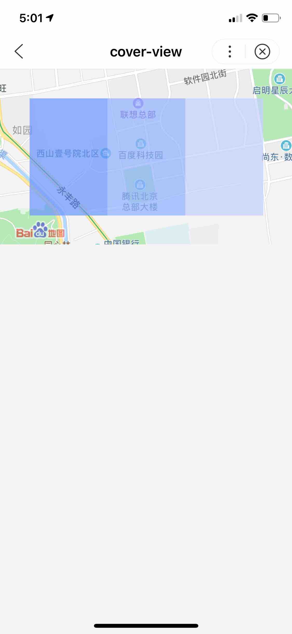
cover-view 文本视图
解释: 覆盖在原生组件之上的文本视图。只支持嵌套cover-view、cover-image组件。客户端创建的原生组件,不支持嵌套在其它组件中使用。
百度APP中扫码体验:

属性说明:
| 属性 |
类型 |
默认值 |
必填 |
说明 |
| scroll-top |
number |
|
否 |
设置顶部滚动偏移量,仅在设置了overflow-y: scroll成为滚动元素后生效 |
示例:
在开发者工具中预览效果
在 swan 文件中
1
2
3
4
5
6
7
8
9
10
11
12
13
| <map id="myMap"
longitude="{{longitude}}"
latitude="{{latitude}}">
<cover-view class="cover-view">
<cover-view class="container">
<cover-view class="flex-wrp" style="flex-direction:row;">
<cover-view class="flex-item demo-text-1"></cover-view>
<cover-view class="flex-item demo-text-2"></cover-view>
<cover-view class="flex-item demo-text-3"></cover-view>
</cover-view>
</cover-view>
</cover-view>
</map>
|
在 js 文件中
1
2
3
4
5
6
7
8
9
| Page({
data: {
latitude: '40.042500',
longitude: '116.274040'
},
onReady() {
this.mapContext = swan.createMapContext('myMap');
}
});
|
图示
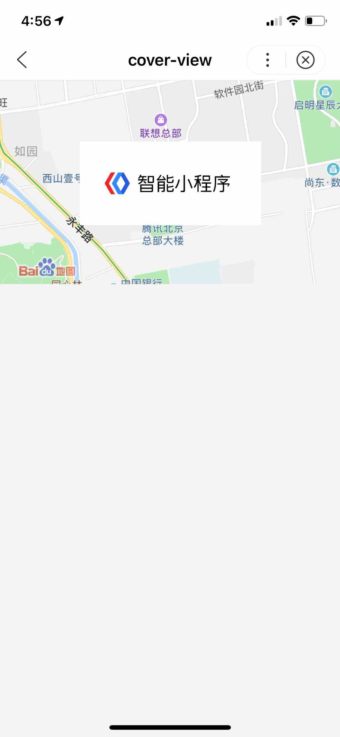
cover-image 图片视图
解释:覆盖在原生组件之上的图片视图(与 cover-view 相比,仅支持图片),支持嵌套在 cover-view 里。
百度APP中扫码体验:

属性说明:
| 属性名 |
类型 |
默认值 |
必填 |
说明 |
| src |
String |
|
否 |
图标路径,支持临时路径、网络地址。暂不支持 base64 格式。 |
| bindload |
EventHandle |
|
否 |
图片加载成功时触发 |
| binderror |
EventHandle |
|
否 |
图片加载失败时触发 |
示例:
在开发者工具中预览效果
1
2
3
4
5
| <map id="myMap" style="width: 100%" longitude="{{longitude}}" atitude="{{latitude}}">
<cover-image class="cover-image"
src="https://b.bdstatic.com/miniapp/image/cover-image.png">
</cover-image>
</map>
|
图示
Bug & Tip:
- 支持 css transition 动画,transition-property 只支持 transform (translateX, translateY) 与 opacity。
- 文本建议都套上 cover-view 标签,避免排版错误。
- 只支持基本的定位、布局、文本样式。不支持设置单边的 border、background-image、shadow、overflow: visible 等。
- 建议子节点不要溢出父节点。
- 默认设置的样式有:white-space: nowrap; line-height: 1.2; display: block。
- 建议不要频繁改变 s-if 表达式的值控制显隐,否则会导致 cover-view 显示异常。
- IOS端暂不支持一个页面有多个video时嵌套cover-view。
- cover-view 和 cover-image 从基础库版本1.12.0开始支持事件捕获、冒泡。
- cover-image和cover-view的渲染顺序与页面中的标签使用顺序一致。